3 Tips For Highly Converting Websites
Conversion. That’s the bottom line of a website.
Have engaging call to actions!
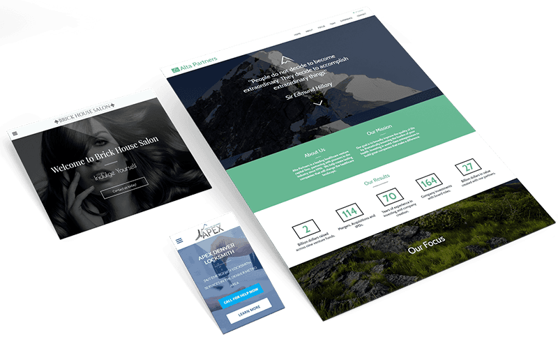
Call-to-actions (CTAs) are important on websites because they help guide users towards taking a specific action, such as making a purchase, filling out a form, or subscribing to a newsletter. Without CTAs, website visitors may not know what to do next or may not be motivated to take any action.
CTAs serve as signposts that tell visitors what they can do on a website and what the website owner wants them to do. They can be placed in various locations on a website, including in the header, footer, sidebar, or within the content itself. They are typically designed to stand out visually, often using contrasting colors or bold fonts, and are usually accompanied by a short, compelling message.
Effective CTAs can help improve conversion rates, which is the percentage of visitors who take a desired action on a website. They can also help improve user experience by making it clear and easy for visitors to navigate a website and find what they are looking for.
In summary, CTAs are an essential element of website design because they guide users towards taking a specific action and help improve conversion rates and user experience.
Simple Navigation
Websites that have high conversion rates often prioritize clear and simple navigation that follows standard conventions. This means placing menu elements where users expect to find them, such as in the top menu, sidebar, or footer, and keeping the number of navigation elements to a minimum. By arranging navigation items in a logical order and using breadcrumbs to assist with navigation, visitors can quickly and easily find the information they need.
Having a well-designed navigation system is crucial for improving user experience and increasing the likelihood of conversion. By making it easy for users to navigate through a website, they are more likely to stay engaged and find what they are looking for. Additionally, a clear and simple navigation system can help build trust with visitors and increase the chances of them returning to the website in the future.
Overall, following navigation conventions and prioritizing clear and simple navigation is a key factor in creating a converting website that meets the needs of its visitors.
Upgrade your content with videos
Websites that have high conversion rates often prioritize clear and simple navigation that follows standard conventions. This means placing menu elements where users expect to find them, such as in the top menu, sidebar, or footer, and keeping the number of navigation elements to a minimum. By arranging navigation items in a logical order and using breadcrumbs to assist with navigation, visitors can quickly and easily find the information they need.
Having a well-designed navigation system is crucial for improving user experience and increasing the likelihood of conversion. By making it easy for users to navigate through a website, they are more likely to stay engaged and find what they are looking for. Additionally, a clear and simple navigation system can help build trust with visitors and increase the chances of them returning to the website in the future.
Overall, following navigation conventions and prioritizing clear and simple navigation is a key factor in creating a converting website that meets the needs of its visitors.